Dawn Of The New Gmail User Interface
October 13, 2022Welcome back to the Damson Cloud Blog and more importantly, the second installment of our spooky Halloween updates. This week, our professional trainer Noelle Kerr is going to be looking at something new that you may have noticed on your Gmail account recently- the new User Interface.
While some of us may be opposed to change and prefer sticking to what we’re used to, especially with something like our email platform which is one of our most used applications, we’re here to show you why the new User Interface on Gmail will be a welcomed addition to your everyday routine.
So, if you’re interested in hearing more about this and why we’d recommend using it, stay tuned!
New Gmail User Interface: Why Should I Make The Switch?
We’re now going to review some of the reasons why we think you should make the switch to the new User Interface on Gmail. These include:
New Gmail User Interface And Navigation:
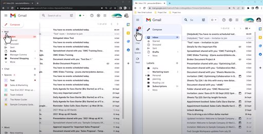
When using the old User Interface on Gmail, if the menu is collapsed, the menu can become extremely cluttered. For anyone who prefers their desktop to be organised, this layout can be a little chaotic. For new users, this can also be extremely confusing as the icon-only menu makes it hard to identify what each application is without prior knowledge of Google Workspace or Gmail.
However, with the new Gmail Interface, this has been simplified and the line navigation has now adapted a smooth hovering menu. It also makes use of both text and icons, making it easier and more accessible for new users to adapt to.
New Gmail User Interface Within Chats And Spaces:
We’re now going to take a look at how the new User Interface has impacted Google Chats and Google Spaces.
Before, with the old User Interface and with the email menu extended, it was easy to miss a new chat message notification. With the new Interface update, chat notifications are always within your eye line and the notification bubble which now appears upon receiving a chat message also alerts users to the unread message.
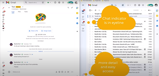
If you enjoy the Chat feature on Gmail, you’ll be pleased to know that with the new User Interface, replying to chat messages has gotten much easier.
Previously, you would have to first click on the Spaces menu and from here, select the Space to access the message and respond.
Now, with the new User Interface, you simply need to hover over the notification bubble to get a quick reply option or alternatively, you can quickly find the space in the hover menu and click once on this to access the message and reply.
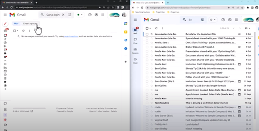
With the old User Interface on Gmail, you were able to search for chats from the inbox search bar at the top of the screen. To do this, you had to type in the search term of your choice and select ‘Chats and Spaces’ as shown below.
Gmail users will be happy to know that with the new User Interface, this feature hasn’t changed at all, so searching for conversations within a Google Chat is as easy as ever!
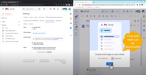
A new feature of the new User Interface on Gmail is that you can now switch off Google Meet from within this. To do this, go to Quick Settings, click on Chats and Meet and select the applications you would like to switch on or off.
New Gmail User Interface And Labels:
We’re now going to look at labels in Gmail and how these look before and after the new User Interface.
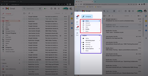
With the new application-specific pop-out menus, your custom labels will no longer appear cramped. With the old navigation bar, to see all of your labels, you had to manually make the navigation bar bigger to ensure all of the labels could be viewed at once.
With the new navigation bar, there is lots of space for all of your labels to be shown without having to scroll or adjust the current screen view as shown below.
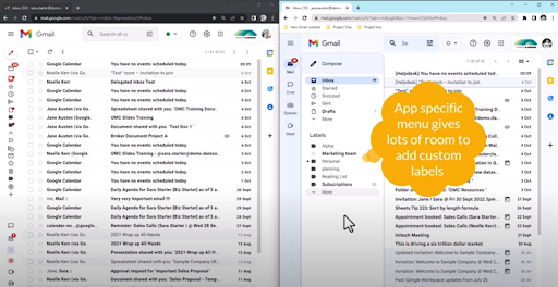
As well as this, the new hover menu clearly differentiates between custom and default labels so these are easier to identify. While previously both sets of labels were grouped together, these now have their own separate spaces.
New Gmail User Interface And Visibility/Accessibility:
When an application makes big changes, one of the hardest changes to adapt to is usually the change to how something looks. We’re now going to dive into the changes in visibility and accessibility with the new Gmail User Interface.
Users may notice that with the new Interface, colour grading has been used to distinguish between certain areas of the inbox, for example, inbox, navigation and action areas.
Gmail has also removed the red text that they previously used, replacing the default colour of the inbox to a calming blue. This improves accessibility and user experience for those with colour blindness who may have found the previous red text difficult to read.
Final Thoughts On The New Gmail User Interface
While we here at Damson Cloud personally love the new Gmail User Interface, if you decide that this update is not for you, you can of course switch back to the old Interface… for now.
To do this, simply go to Quick Settings and click on ‘Go back to the original view’. Google will then ask you to provide feedback before resetting your User Interface to the default setting.
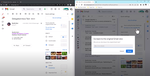
Please note: There is currently no confirmation for how long you will be able to opt-out of using the new User Interface on Gmail.
We hope you’ve enjoyed this week’s update on the new Gmail User Interface. As always, we want to hear from you- Will you be embracing the change of the new Gmail Interface or do you prefer keeping things the way you’re comfortable with? Let us know in the comments of our YouTube video!
As a longstanding member of the Google Cloud Partner Program, Damson Cloud specialises in bringing people and ideas together through new ways of working. We champion the very best practices in remote working and change management, helping companies and their teams collaborate productively from anywhere in the world. To find out more about our services, check out our library of tutorial videos or our blog.